on 26 August, 2013
Winning Presentations..
"There are always three kind of speeches for every speech you actually gave viz. the one you practiced, the one you gave and the one you wish you gave"
- Dale Carnegie
Recently, our college had organised a mock presentation where we had to give a short description of our final year project using powerpoint presentation (PPT). After making the PPT slides, my friends and I exchanged it with each other and I realised that many had messed up their PPT. Of course, I’m no PPT expert but over the last few years I’ve given way many PPT presentations and now, I can at least differentiate between good and bad ones. This is the sole reason I thought to jot down a few points to help all of you. Feel free to add more points (See Comment Box below).
1. Follow the 20/80 ratio:
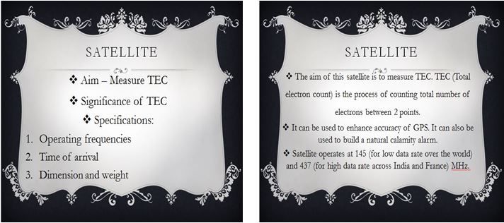
One common mistake that people do while making the PPT is that they end up writing long sentences. PPT slides should just have points . If you put everything in the slide then what’s the use of giving the presentation? Audiences are literate enough to read those points and understand it themselves. Slides are there to support you; not to talk for you. So, make sure that 20% of your topic is shown in slides and the remaining 80% is verbally explained. For better understanding, check the difference between the two below -

2. Colour Selection and Consistency:
Selection of the background is one section where, I feel, most of the time gets wasted. However, this is the most important step because the colours look different on desktop and on a projector. One thing that you really need to make sure is that your slides should not mix with the white screen/wall. I’ve seen people using plain white slides for PPT. When a white slide is projected on a white screen, all you see are black words and this looks pretty boring. I’m not saying that you shouldn’t use white. All I’m saying is that the slide should be a mixture of some colour along with white. Same rule should be applied for fonts. While selecting font’s size/colour, just keep in mind that this font will look different once it is projected. So, while making the PPT, keep in mind the factors such as size, type of font, colour of font, etc. After deciding these parameters, make sure that you use those same parameters for all slides.
3. Reasonable Clip Arts:
Clip arts can give an upper edge to your PPT provided you use it wisely. Use clip arts only if your slide looks empty. Also, make sure that you use relevant clip arts.
4. Be Original, Be You:
We love copy paste. Everyone does. But that's one thing which has annoyed me for life. I mean, I really don’t have a problem when people do that but when you are copying content from somebody else, aren’t you insulting your own intelligence? It's absolutely fine to take references from a couple of PPTs but be as orginial as you can. This is Who knows you might end up making a better PPT.
5. Be Prepared:
I usually don’t waste much time on memorising the contents that I’ve put in my slides. But this does not mean that I don’t practice. Before 'the' day, just take one or two demo sessions in front of a mirror or, if you feel stupid to talk to yourself, then you can just rehearse your dialogues in your head. Remember to KISS. Oh, that's Keep It Simple & Straight! Talk freely. Keep in mind that you know your slides way better than your audience so don’t be scared about making mistakes because even if you do, people would hardly notice it (provided the mistake is not a major one).
These are just a few key points that I wanted to share it with you. A lot of general, unsaid data comes into the picture like being loud, clear, wearing formals, etc. which I'm sure everyone will take care of. Wishing you all the good luck!
Login to recommend
0 recommended
2539 views

 STUPIDSID